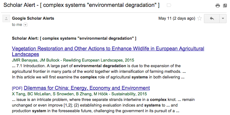
If you’re like me, you have a pile of Google Scholar Alerts that you never manage to read. It’s a reflection of a more general problem: how do you find good articles, when there are so many articles to sift through?
I’ve recently started using Sux0r, a Bayesian filtering RSS feed reader. However, Google Scholar sends alerts to one’s email, and we’ll want to extract each paper as a separate RSS item.
Here’s my process, and the steps for doing it yourself:
Google Scholar Alerts → IFTTT → Blogger → Perl → DreamHost → RSS → Bayesian Reader
- Create a Blogger blog that you will just use for Google Scholar Alerts: Go to the Blogger Home Page and follow the steps under “New Blog”.
- Sign up for IFTTT (if you don’t already have an account), and create a new recipe to post emails from scholaralerts-noreply@google.com to your new blog. The channel for the trigger is your email system (Gmail for me); the trigger is “New email in inbox from…”; the channel for the action is Blogger; and the title and labels can be whatever you want as along as the body is “{{BodyPlain}}” (which includes HTML).

- Modify the Perl code below, pointing it to the front page of your new Blogger blog. It will return an RSS feed when called at the command line (perl scholar.pl).
- Upload the Perl script to your favorite server (mine, https://existencia.org/, is powered by DreamHost.
- Point your favorite RSS reader to the URL of the Perl script as an RSS feed, and wait as the Google Alerts come streaming in!
Here is the code for the Alert-Blogger-to-RSS Perl script. All you need to do is fill in the $url line below.
#!/usr/bin/perl -w
use strict;
use CGI qw(:standard);

use XML::RSS; # Library for RSS generation
use LWP::Simple; # Library for web access

# Download the first page from the blog
my $url = "http://mygooglealerts.blogspot.com/"; ### <-- FILL IN HERE!
my $input = get($url);
my @lines = split /\n/, $input;

# Set up the RSS feed we will fill
my $rss = new XML::RSS(version => '2.0');
$rss->channel(title => "Google Scholar Alerts");

# Iterate through the lines of HTML
my $ii = 0;
while ($ii < $#lines) {
    my $line = $lines[$ii];
    # Look for a <h3> starting the entry
    if ($line !~ /^<h3 style="font-weight:normal/) {
        $ii = ++$ii;
        next;
    }

    # Extract the title and link
    $line =~ /<a href="([^"]+)"><font .*?>(.+)<\/font>/;
    my $title = $2;
    my $link = $1;

    # Extract the authors and publication information
    my $line2 = $lines[$ii+1];
    $line2 =~ /<div><font .+?>([^<]+?) - (.*?, )?(\d{4})/;
    my $authors = $1;
    my $journal = (defined $2) ? $2 : '';
    my $year = $3;

    # Extract the snippets
    my $line3 = $lines[$ii+2];
    $line3 =~ /<div><font .+?>(.+?)<br \/>/;
    my $content = $1;
    for ($ii = $ii + 3; $ii < @lines; $ii++) {
        my $linen = $lines[$ii];
        # Are we done, or is there another line of snippets?
        if ($linen =~ /^(.+?)<\/font><\/div>/) {
            $content = $content . '<br />' . $1;
            last;
        } else {
            $linen =~ /^(.+?)<br \/>/;
            $content = $content . '<br />' . $1;
        }
    }
    $ii = ++$ii;

    # Use the title and publication for the RSS entry title
    my $longtitle = "$title ($authors, $journal $year)";

    # Add it to the RSS feed
    $rss->add_item(title => $longtitle,
                   link => $link,
                   description => $content);

    $ii = ++$ii;
}

# Write out the RSS feed
print header('application/xml+rss');
print $rss->as_string;
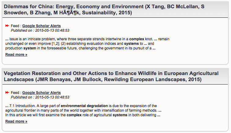
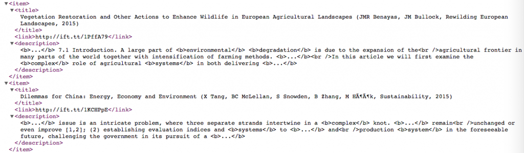
In Sux0r, here are a couple of items form the final result: