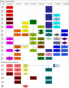
Sometimes a diagram helps me find order in chaos, and sometimes it’s just a way to stroke my ego. I was recently trying to make sense of my graduate school classes, even as they’re becoming a less and less important share of my gradschool learning. So, I added to a diagram I’d made ten years ago for college. Â In the end, I’m not sure which purpose it serves more.
The diagram is arrayed by discipline and year. The disciplines are arranged like a color wheel (and classes colored accordingly), from theoretical math, through progressively more applied sciences, through engineering and out the other end into applied humanities (like music), and finally back to theoretical philosophy. Arrows give a sense of thematic and prerequisite relationships.
Economics, a core of the Sustainable Development program, probably sits around the back-side of the spectrum, between philosophy and math. I squeezed it in on the left, more as a reflection of how I’ve approached it than what it tried to teach.
This is also missing everything I’ve learned from classes I’ve taught. I wish there were a place for Progressive Alternatives from two years ago, or Complexity Science from last year. I guess I need another diagram.


0 responses so far ↓
There are no comments yet...Kick things off by filling out the form below.