People often assume that since I have background in computers, I must be an enthusiast of blockchain technology. I have never seen much use for it, since anything that blockchains can do, a traditional database can do more efficiently. But I understand that blockchains have an application, a situation in which they are the right tool for the job: if you cannot build a trustworthy institution and want to keep shared records, blockchains will let you.
By institutions, I mean organizations like banks or government, which could keep these records, along with a common understanding of the rules they use. If I, as an individual, want to make a system for distributed, anonymous users to keep records, it is easy to make an interface to a database that provides that. I would define the rules, and my software would follow them. But then you have to trust me to not use my power over the rules to my advantage. Or, in the case of societal institutions, we have to believe in systems of oversight to ensure good behavior and procedures for responding to bad behavior. If you cannot trust a central authority, traditional databases will not work.
The cost to pay for this lack of trust is energy use. The blockchain mining system turns computing power into security, with bitcoin alone consuming more electricity annually than Austria (73 TWh/yr vs. 70 TWh/yr). Blockchain technology is built on plentiful, cheap energy.
I think the excitement about blockchain technology offers some insight into the world today, and the world that we are working to create. The world that blockchains are made for is a world of abundance, but abundance squandered by the lack of trusted institutions. And that is not all.
It is a world not overly concerned with inequality. If there was extreme inequality of mining power, or collusion at the top, blockchain ledgers could be forged. Instead, the fear is against petty theft. We worry about minor actors breaking the law, and no institutions to recognize it and undo the damage.
It is a world where anonymity is supreme. Letting institutions know our identity a necessary condition for allowing them to provide oversight. In a world of corrupt institutions, your identity might be used against you.
It is a world in which you pay to maintain your own security. As mining rewards dwindle, it will be those who have the most to lose who will maintain the system. But in this, it must also be a world of continual competition, because if a single user or cartel effectively paid for the whole system, it would also control the ledgers.
So, when people express such excitement about this or that application of blockchains, I mourn the loss of cooperation and common ground. Only a world of abundance could support blockchains, but only a fragmented world would need them.
I recently had the pleasure of speaking last week to the Science and Policy Summer School, in Paris. This is an interdisciplinary event that I helped to start back in 2011, under the tutelage of Laurence Tubiana, bringing together students from Columbia’s Sustainable Development program, Sciences Po’s IDDRI, and various Masters’ programs, to have some big discussions on bridging the gap between science and policy.
The topic for this year was “Methods in Sustainable Development”. For my part, I gave a 10,000 ft. view of Complexity Science, and some of the methods available from it.
Here is my complexity science methods presentation, in Prezi form.
At the Sustainable Development Research (SusDeveR) conference this weekend, I offered some simple tools for performing Bayesian Regressions: Jump to the Github Repository.
The point of these templates is to make it possible for anyone who is familiar with OLS to run a Bayesian regression. The templates have a chunk at the top to change for your application, and a chunk at the bottom that uses Gelman et al.’s Stan to estimate the posterior parameter distributions.
In general, the area at the top is just to create an output vector and a predictor matrix. Like this:
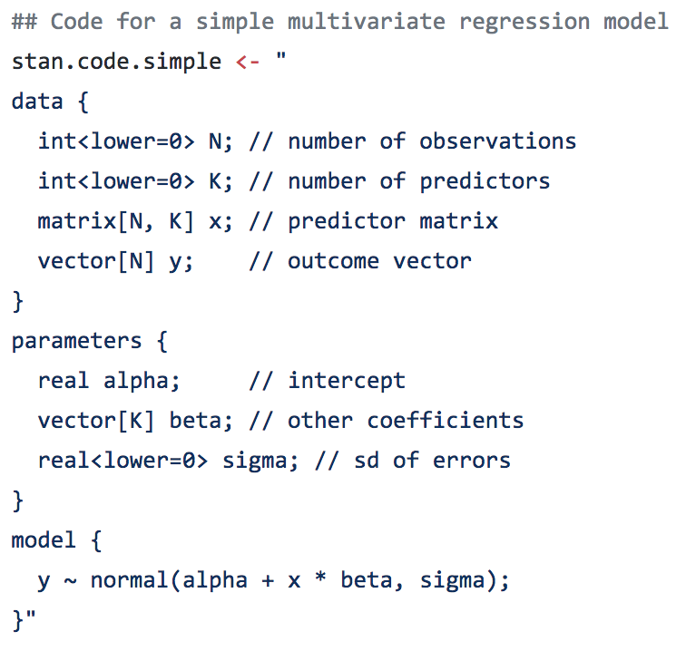
The template part has all of the Stan code, which (for a Bayesian regression) always has a simple form:
The last line does all of the work, and just says (in OLS speak) that the error distribution follows a normal distribution. Most of the templates also have a more efficient version, which does the same thing.
I say in the README what Bayesian regressions are and what they do. But why use them? The simple answer is that we shouldn’t expect the uncertainty on our parameters to be well-behaved. It’s nice if it is, and then OLS and Bayesian regressions will give the same answer. But if the true uncertainty on your parameter of interest is skewed or long-tailed or bimodal, the OLS assumption can do some real harm.
Plus, since Bayesian regressions are just a generalization of MLE, you can setup any functional form you like, laying out multiple, nonlinear expressions, estimating intermediate variables, and imposing additional probabilistic constraints, all in one model. Of course, the templates don’t show you how to do all that, but it’s a start.
The water-energy-food nexus has become a popular buzz-word in the sustainability field. It aims to capture the idea that water, energy, and food challenges are intertwined, and that shocks to any one can precipitate problems to all three.
I’ve often wondered how closely these three are intertwined though. Water is certainly needed for energy (for thermoelectric cooling and hydropower), but the reverse link (mostly pumping) seems a lot weaker. Water is also needed for food production, but is food needed for water availability? Energy and food have some links, with a fair amount of energy needed to produce fertilizer, and a some “food” production actually going to biofuelds, but the sizes aren’t clear.
Below is my attempt to show these flows, for the United States:
It seems to me, based on this, that this is less a nexus than water-centered system. Every drop of water is fought over for energy, food, and urban production. It’s less a interconnected nexus than a hub-with-spokes. A way to recognize that water is at the center of it all.
Sources:
– Hydrological flows: Total water (GW+SW) extractions from USGS. Food system only has irrigation and livestock; energy only has thermoelectric. The rest make up the difference.
– Energy system flows: Food system energy from Canning, P. 2010. Energy Use in the U.S. Food System. USDA Economic Research Report Number 94; “In 2010, the U.S. water system consumed over 600 billion kWh, or approximately 12.6 percent of the nation’s energy according to a study by researchers at the University of Texas at Austin.” from http://www.ncsl.org/research/environment-and-natural-resources/overviewofthewaterenergynexusintheus.aspx “Energy consumption by public drinking water and wastewater utilities, which are primarily owned and operated by local governments, can represent 30%-40% of a municipality’s energy bill.” from https://fas.org/sgp/crs/misc/R43200.pdf; remainder to 100%.
– Biofuels: 18.38e6 m^3 ethanol + 1.7e6 m^3 biodiesel, at a density of 719.7 kg/m^3 is 14.45e6 MT.
– Remainder of food: https://www.ers.usda.gov/topics/international-markets-trade/us-agricultural-trade/import-share-of-consumption.aspx reports 635 billion pounds consumption, 81% of which was domestically produced.
After NASA released the 2017 global average temperature, I started getting worried. 2017 wasn’t as hot as last year, but it was well above the trend.
NASA yearly average temperatures and loess smoothed.
Three years above the trend is pretty common, but it makes you wonder: Do we know where the trend is? The convincing curve above is increasing at about 0.25°C per decade, but in the past 10 years, the temperature has increased by almost 0.5°C.
Depending on how far back you look, the more certain you are of the average trend, and the less certain of the recent trend. Back to 1900, we’ve been increasing at about 0.1°C per decade; in the past 20 years, about 0.2°C per decade; and an average of 0.4°C per decade in the past 10 years.
A little difference in the trend can make a big difference down the road. Take a look at where each of these get you, uncertainty included:
A big chunk of the fluctuations in temperature from year to year are actually predictable. They’re driven by cycles like ENSO and NAO. I used a nice data technique called “singular spectrum analysis” (SSA), which identifies the natural patterns in data by comparing a time-series to itself at all possible offsets. Then you can take extract the signal from the noise, as I do below. Black is the total timeseries, red is the main signal (the first two components of the SSA in this case), and green is the noise.
Once the noise is gone, we can look at what’s happening with the trend, on a year-by-year basis. Suddenly, the craziness of the past 5 years becomes clear:
It’s not just that the trend is higher. The trend is actually increasing, and fast! In 2010, temperatures were increasing at about 0.25°C per decade, an then that rate began to jump by almost 0.05°C per decade every year. The average from 2010 to 2017 is more like a trend that increases by 0.02°C per decade per year, but let’s look at where that takes us.
If that quadratic trend continues, we’ll blow through the “safe operating zone” of the Earth, the 2°C over pre-industrial temperatures, by 2030. Worse, by 2080, we risk a 9°C increase, with truly catastrophic consequences.
This is despite all of our recent efforts, securing an international agreement, ramping up renewable energy, and increasing energy efficiency. And therein lies the most worrying part of it all: if we are in a period of rapidly increasing temperatures, it might be because we have finally let the demon out, and the natural world is set to warm all on its own.
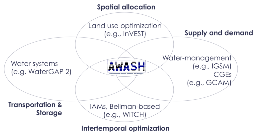
I’ve built a new tool for working with county-level data across the United States. The tool provides a kind of clearing-house for data on climate, water, agriculture, energy, demographics, and more! See the details on the AWASH News page.
The 9,322 gauges in the GAGES II database are picked for having over 20 years of reliable streamflow data from the USGS archives. Combined, these gauges represent over 400,000 years of data.
They offer a detailed sketch of water availability over the past century. But they miss the opportunity to describe a even fuller portrait.
In the AWASH model, we focus on not only gauged points within the river network and other water infrastructure like reservoirs and canals, but also on the interconnections between these nodes. When we connect gauge nodes into a network, we can infer something about the streamflows between them. In total, our US river network contains 22,619 nodes, most of which are ungauged.
We can use the models and the structure of the network to infer missing years, and flows for ungauged junctions. To do so, we create empirical models of the streamflows for any guages for which we have a complete set of gauged of upstream parents. The details of that, and the alternative models that we use for reservoirs, can be details for another post. For the other nodes, we look for structures like these:

Structures for which we can infer missing month values, where hollow nodes are ungauged and solid nodes are gauged.
If all upstream values are known, we can impute the downstream; if the downstream value is known and all but one upstream values are known, we can impute the remaining one; if upstream or downstream values can be imputed according to these rules, they may allow other values to be imputed using that new knowledge. Using these methods, we can impute an average of 44 years for ungauged flows, and an average 20 additional years for gauged flows. The result is 1,064,000 years of gauged or inferred streamflow data.
We have made this data available as a Zenodo dataset for wider use.
When I tell people I study climate change, sooner or later they usually ask me a simple question: “Is it too late?” That is, are we doomed, by our climate inaction? Or, less commonly, they ask, “But what do we really know?”
With our new paper, Estimating Economic Damage from Climate Change in the United States, I finally have an answer to both of these questions; one that is robust and nuanced and shines light on what we know and still need to understand.
The climate change that we have already committed is going to cost us trillions of dollars: at least 1% of GDP every year until we take it back out of the atmosphere. That is equivalent to three times Trump’s proposed cuts across all of the federal programs he cuts.
If we do not act quickly, that number will rise to 3 – 10% by the end of the century. That includes the cost of deaths from climate change, lost labor productivity, increased energy demands, costal property damage. The list of sectors it does not include– because the science still needs to be done– is much greater: migration, water availability, ecosystems, and the continued potential for catastrophic climate tipping points.
But many of you will be insulated from these effects, by having the financial resources to adapt or move, or just by living in cooler areas of the United States which will be impacted less. The worst impacts will fall on the poor, who in the Untied States are more likely to live in hotter regions in the South and are less able to respond.
One of the most striking results from our paper is the extreme impact that climate change will have on inequality in the United States. The poorest 10% of the US live in areas that lose 7 – 17% of their income, on average by the end of the century, while the richest 10% live where in areas that will lose only 0 – 4%. Climate change is like a subsidy being paid by the poor to the rich.
That is not to say that more northern states will not feel the impacts of climate change. By the end of the century, all by 9 states will have summers that are more hot and humid than Louisiana. It just so happens that milder winters will save more lives in many states in the far north than heat waves will kill. If you want to dig in deeper, our data is all available, in a variety of forms, on the open-data portal Zenodo. I would particularly point people to the summary tables by state.
What excites me is what we can do with these results. First, with this paper we have produced the first empirically grounded damage functions that are driven by causation rather than correlation. Damage functions are the heart of an “Integrated Assessment Model”, the models that are used by the EPA to make cost-and-benefit decisions around climate change. No longer do these models need to use out-dated numbers to inform our decisions, and our numbers are 2-100 times as large as they are currently using.
Second, this is just the beginning of a new collaboration between scientists and policy-makers, as the scientific community continues to improve these estimates. We have built a system, the Distributed Meta-Analysis System, that can assimilate new results as they come out, and with each new result provide a clearer and more complete picture of our future costs.
Finally, there is a lot that we as a society can do to respond to these projected damages. Our analysis suggests that an ounce of protection is better than a pound of treatment: it is far more effective (and cheaper) to pay now to reduce emissions than to try to help people adapt. But we now know who will need that help in the United States: the poor communities, particularly in the South and Southeast.
We also know what needs to be done, because the biggest brunt of these impacts by far comes from pre-mature deaths. By the end of the century, there are likely to be about as many deaths from climate change as there are currently car crashes (about 9 deaths per 100,000 people per year). That can be stemmed by more air-conditioning, more real-time information and awareness, and ways to cool down the temperature like green spaces and white roofs.
Our results cover the United States, but some of the harshest impacts will fall on poorer countries. At the same time, we hope the economies of those countries will continue to grow and evolve, and the challenges of estimating their impacts need to take this into account. That is exactly what we are now doing, as a community of researchers at UC Berkeley, the University of Chicago, and Rutgers University called the Climate Impacts Lab. Look for more exciting news as our science evolves.
Environmental Modelling & Software has just published my work on a new technique for coupling models: Probabilistic Coupling. My thoughts on coupled models had been percolating for a couple years, before a session at the International Conference on Conservation Biology in 2013 offered me a chance to try it out.
Probabilistic coupling has three main goals:
- Allowing models to be coupled without distortionary feedback
- Allowing multiple models to inform the same variable
- Allowing models to be coupled with different scales
With these three features, the very nature and approach of coupling models can change. Current model coupling requires carefully connecting models together, plugging inputs into outputs, and then recalibrating to recover realistic behavior again. Instead, this allows for what I call “Agglomerated Modeling”, where models are thrown together into a bucket and almost magically sort themselves out.
The code for the model is available within the OpenWorld framework, as the coupling example.
One of the rolling banners at last year’s meeting of the American Geophysical Union had a scantly-clad woman and the words “This is what most people think of as a ‘model'”. See, scientists have a communications problem. It’s insidious, and you forget how people use words and then feel attacked when you have to change how you speak.
I have a highly-educated editor working with me on the coffee and climate change report, and she got caught up on a word I use daily: “coefficient”. For me, a coefficient is just a kind of model parameter. I replaced all the uses of “coefficient” with “parameter”, but I simultaneously felt like it dumbed out an important distinction and wondered if “parameter” was still not dumbed down enough.
AGU has a small team trying to help scientists communicate better. I think they are still trying to figure out how to help those of us who want their help. I went to their session on bridging the science-policy divide, and they spent a half hour explaining that we have two houses of congress. Nonetheless, it is a start, and they sent us home with communication toolkits on USB. One gem stood out in particular:
So I will try to reduce the ignorance and political distortions of my devious communication plots, until I can flip the zodiac on this good response loop. Wish me luck.