James A. Rising

Extrapolating the 2017 Temperature

February 5, 2018 · Leave a Comment

After NASA released the 2017 global average temperature, I started getting worried. 2017 wasn’t as hot as last year, but it was well above the trend.


NASA yearly average temperatures and loess smoothed.

Three years above the trend is pretty common, but it makes you wonder: Do we know where the trend is? The convincing curve above is increasing at about 0.25°C per decade, but in the past 10 years, the temperature has increased by almost 0.5°C.

Depending on how far back you look, the more certain you are of the average trend, and the less certain of the recent trend. Back to 1900, we’ve been increasing at about 0.1°C per decade; in the past 20 years, about 0.2°C per decade; and an average of 0.4°C per decade in the past 10 years.

A little difference in the trend can make a big difference down the road. Take a look at where each of these get you, uncertainty included:

A big chunk of the fluctuations in temperature from year to year are actually predictable. They’re driven by cycles like ENSO and NAO. I used a nice data technique called “singular spectrum analysis” (SSA), which identifies the natural patterns in data by comparing a time-series to itself at all possible offsets. Then you can take extract the signal from the noise, as I do below. Black is the total timeseries, red is the main signal (the first two components of the SSA in this case), and green is the noise.

Once the noise is gone, we can look at what’s happening with the trend, on a year-by-year basis. Suddenly, the craziness of the past 5 years becomes clear:

It’s not just that the trend is higher. The trend is actually increasing, and fast! In 2010, temperatures were increasing at about 0.25°C per decade, an then that rate began to jump by almost 0.05°C per decade every year. The average from 2010 to 2017 is more like a trend that increases by 0.02°C per decade per year, but let’s look at where that takes us.

If that quadratic trend continues, we’ll blow through the “safe operating zone” of the Earth, the 2°C over pre-industrial temperatures, by 2030. Worse, by 2080, we risk a 9°C increase, with truly catastrophic consequences.

This is despite all of our recent efforts, securing an international agreement, ramping up renewable energy, and increasing energy efficiency. And therein lies the most worrying part of it all: if we are in a period of rapidly increasing temperatures, it might be because we have finally let the demon out, and the natural world is set to warm all on its own.

→ Leave a CommentCategories: Data · Research

January 17, 2018 · Leave a Comment

I’ve built a new tool for working with county-level data across the United States. The tool provides a kind of clearing-house for data on climate, water, agriculture, energy, demographics, and more! See the details on the AWASH News page.

→ Leave a CommentCategories: Uncategorized

1 Million Years of Stream Flow Data

January 16, 2018 · Leave a Comment

The 9,322 gauges in the GAGES II database are picked for having over 20 years of reliable streamflow data from the USGS archives. Combined, these gauges represent over 400,000 years of data.
They offer a detailed sketch of water availability over the past century. But they miss the opportunity to describe a even fuller portrait.

In the AWASH model, we focus on not only gauged points within the river network and other water infrastructure like reservoirs and canals, but also on the interconnections between these nodes. When we connect gauge nodes into a network, we can infer something about the streamflows between them. In total, our US river network contains 22,619 nodes, most of which are ungauged.

We can use the models and the structure of the network to infer missing years, and flows for ungauged junctions. To do so, we create empirical models of the streamflows for any guages for which we have a complete set of gauged of upstream parents. The details of that, and the alternative models that we use for reservoirs, can be details for another post. For the other nodes, we look for structures like these:

Structures for which we can infer missing month values, where hollow nodes are ungauged and solid nodes are gauged.

If all upstream values are known, we can impute the downstream; if the downstream value is known and all but one upstream values are known, we can impute the remaining one; if upstream or downstream values can be imputed according to these rules, they may allow other values to be imputed using that new knowledge. Using these methods, we can impute an average of 44 years for ungauged flows, and an average 20 additional years for gauged flows. The result is 1,064,000 years of gauged or inferred streamflow data.

We have made this data available as a Zenodo dataset for wider use.

→ Leave a CommentCategories: Data

Economic Damages from Climate Change

June 29, 2017 · Leave a Comment

When I tell people I study climate change, sooner or later they usually ask me a simple question: “Is it too late?” That is, are we doomed, by our climate inaction? Or, less commonly, they ask, “But what do we really know?”

With our new paper, Estimating Economic Damage from Climate Change in the United States, I finally have an answer to both of these questions; one that is robust and nuanced and shines light on what we know and still need to understand.

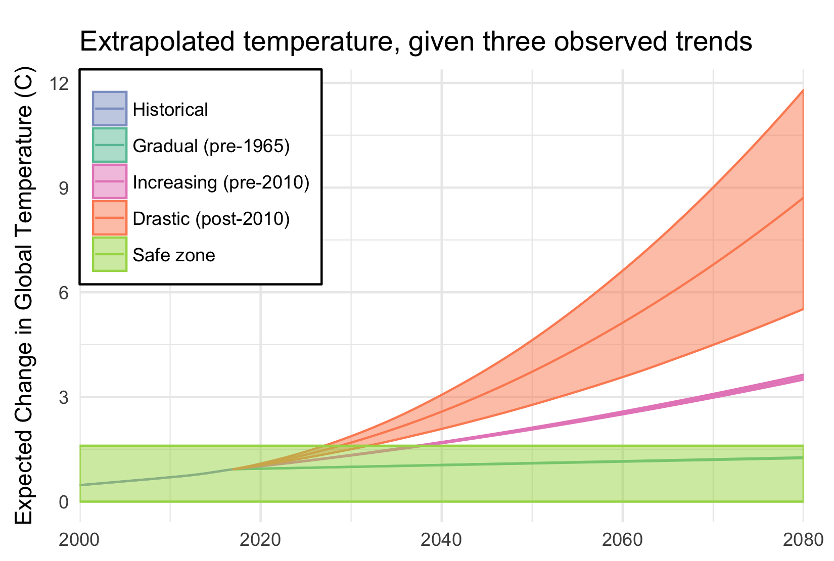
The climate change that we have already committed is going to cost us trillions of dollars: at least 1% of GDP every year until we take it back out of the atmosphere. That is equivalent to three times Trump’s proposed cuts across all of the federal programs he cuts.

If we do not act quickly, that number will rise to 3 – 10% by the end of the century. That includes the cost of deaths from climate change, lost labor productivity, increased energy demands, costal property damage. The list of sectors it does not include– because the science still needs to be done– is much greater: migration, water availability, ecosystems, and the continued potential for catastrophic climate tipping points.

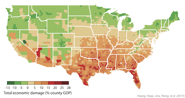
But many of you will be insulated from these effects, by having the financial resources to adapt or move, or just by living in cooler areas of the United States which will be impacted less. The worst impacts will fall on the poor, who in the Untied States are more likely to live in hotter regions in the South and are less able to respond.

Economic damages by income deciles

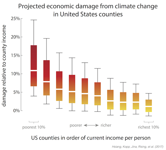
One of the most striking results from our paper is the extreme impact that climate change will have on inequality in the United States. The poorest 10% of the US live in areas that lose 7 – 17% of their income, on average by the end of the century, while the richest 10% live where in areas that will lose only 0 – 4%. Climate change is like a subsidy being paid by the poor to the rich.

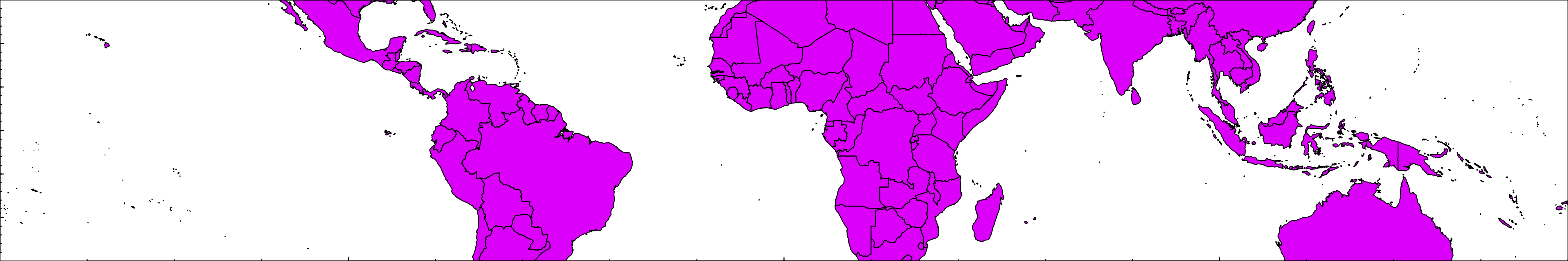
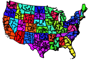
That is not to say that more northern states will not feel the impacts of climate change. By the end of the century, all by 9 states will have summers that are more hot and humid than Louisiana. It just so happens that milder winters will save more lives in many states in the far north than heat waves will kill. If you want to dig in deeper, our data is all available, in a variety of forms, on the open-data portal Zenodo. I would particularly point people to the summary tables by state.

Economic damages by county

What excites me is what we can do with these results. First, with this paper we have produced the first empirically grounded damage functions that are driven by causation rather than correlation. Damage functions are the heart of an “Integrated Assessment Model”, the models that are used by the EPA to make cost-and-benefit decisions around climate change. No longer do these models need to use out-dated numbers to inform our decisions, and our numbers are 2-100 times as large as they are currently using.

Second, this is just the beginning of a new collaboration between scientists and policy-makers, as the scientific community continues to improve these estimates. We have built a system, the Distributed Meta-Analysis System, that can assimilate new results as they come out, and with each new result provide a clearer and more complete picture of our future costs.

Finally, there is a lot that we as a society can do to respond to these projected damages. Our analysis suggests that an ounce of protection is better than a pound of treatment: it is far more effective (and cheaper) to pay now to reduce emissions than to try to help people adapt. But we now know who will need that help in the United States: the poor communities, particularly in the South and Southeast.

We also know what needs to be done, because the biggest brunt of these impacts by far comes from pre-mature deaths. By the end of the century, there are likely to be about as many deaths from climate change as there are currently car crashes (about 9 deaths per 100,000 people per year). That can be stemmed by more air-conditioning, more real-time information and awareness, and ways to cool down the temperature like green spaces and white roofs.

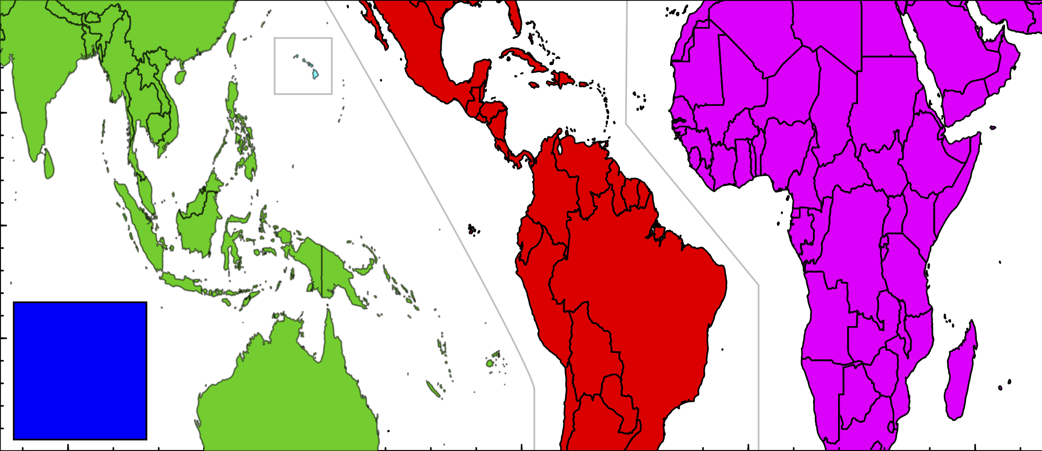
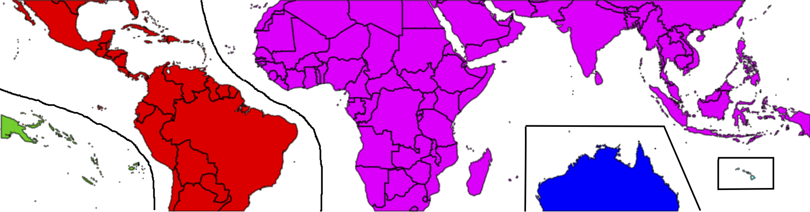
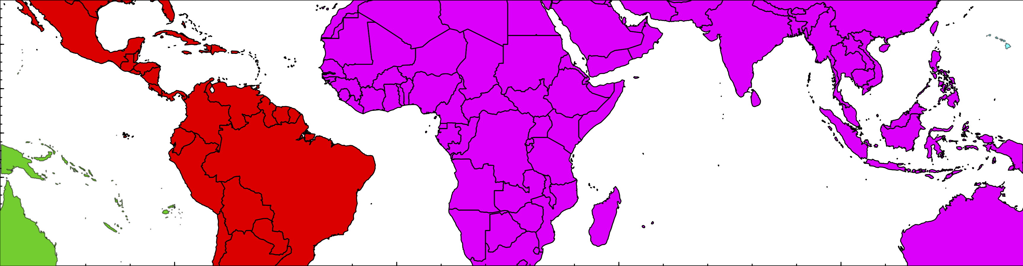
Our results cover the United States, but some of the harshest impacts will fall on poorer countries. At the same time, we hope the economies of those countries will continue to grow and evolve, and the challenges of estimating their impacts need to take this into account. That is exactly what we are now doing, as a community of researchers at UC Berkeley, the University of Chicago, and Rutgers University called the Climate Impacts Lab. Look for more exciting news as our science evolves.

→ Leave a CommentCategories: Research

Probabilistic Coupling

May 1, 2017 · Leave a Comment

Environmental Modelling & Software has just published my work on a new technique for coupling models: Probabilistic Coupling. My thoughts on coupled models had been percolating for a couple years, before a session at the International Conference on Conservation Biology in 2013 offered me a chance to try it out.

Probabilistic coupling has three main goals:

  • Allowing models to be coupled without distortionary feedback
  • Allowing multiple models to inform the same variable
  • Allowing models to be coupled with different scales

With these three features, the very nature and approach of coupling models can change. Current model coupling requires carefully connecting models together, plugging inputs into outputs, and then recalibrating to recover realistic behavior again. Instead, this allows for what I call “Agglomerated Modeling”, where models are thrown together into a bucket and almost magically sort themselves out.

The code for the model is available within the OpenWorld framework, as the coupling example.

→ Leave a CommentCategories: Research · Software

Science and language

February 6, 2016 · Leave a Comment

One of the rolling banners at last year’s meeting of the American Geophysical Union had a scantly-clad woman and the words “This is what most people think of as a ‘model'”. See, scientists have a communications problem. It’s insidious, and you forget how people use words and then feel attacked when you have to change how you speak.

I have a highly-educated editor working with me on the coffee and climate change report, and she got caught up on a word I use daily: “coefficient”. For me, a coefficient is just a kind of model parameter. I replaced all the uses of “coefficient” with “parameter”, but I simultaneously felt like it dumbed out an important distinction and wondered if “parameter” was still not dumbed down enough.

AGU has a small team trying to help scientists communicate better. I think they are still trying to figure out how to help those of us who want their help. I went to their session on bridging the science-policy divide, and they spent a half hour explaining that we have two houses of congress. Nonetheless, it is a start, and they sent us home with communication toolkits on USB. One gem stood out in particular:

So I will try to reduce the ignorance and political distortions of my devious communication plots, until I can flip the zodiac on this good response loop. Wish me luck.

→ Leave a CommentCategories: Essays · Policy

Tropict: A clearer depiction of the tropics

January 15, 2016 · Leave a Comment

Tropict is a set of python and R scripts that adjust the globe to make land masses in the tropics fill up more visual real estate. It does this by exploiting the ways continents naturally “fit into” each other, splicing out wide areas of empty ocean and nestling the continents closer together.

All Tropict scripts are designed to show the region between 30°S and 30°N. In an equirectangular projection, that looks like this:

original

It is almost impossible to see what is happening on land: the oceans dominate. By removing open ocean and applying the Gall-Peters projection, we get a clearer picture:

version4

There’s even a nice spot for a legend in the lower-left! Whether for convenience or lack of time, the tools I’ve made to allow you to make these maps are divided between R and Python. Here’s a handy guide for which tool to use:

decisions

(1) Supported image formats are listed in the Pillow documentation.
(2) A TSR file is a Tropict Shapefile Reinterpretation file, and includes the longitudinal shifts for each hemisphere.

Let’s say you find yourself with a NetCDF file in need of Tropiction, called bio-2.nc4. It’s already clipped to between 30°S and 30°N. The first step is to call splice_grid.py to create a Tropicted NetCDF:

python ../splice_grid.py subjects/bio-2.nc4 ../bio-2b.nc4

But that NetCDF doesn’t show country boundaries. To show country boundaries, you can follow the example for using draw_map.R:

library(ncdf4)
library(RColorBrewer)

## Open the Tropicted NetCDF
database <- nc_open("bio-2b.nc4")
## Extract one variable
map <- ncvar_get(database, "change")

## Identify the range of values there
maxmap <- max(abs(map), na.rm=T)

## Set up colors centered on 0
colors <- rev(brewer.pal(11,"RdYlBu"))
breaks <- seq(-maxmap, maxmap, length.out=12)

## Draw the NetCDF image as a background
splicerImage(map, colors, breaks=breaks)
## Add country boundaries
addMap(border="#00000060")
## Add seams where Tropict knits the map together
addSeams(col="#00000040")

Here’s an example of the final result, for a bit of my coffee work:

arabica-futureb

For more details, check out the documentation at the GitHub page!

And just for fun, here were two previous attempts of re-hashing the globe:

version1

I admit that moving Australia and Hawaii into the India Ocean was over-zealous, but they fill up the space so well!

version3

Here I can still use the slick division between Indonesian and Papua New Guinea and Hawaii fits right on the edge, but Australia gets split in two.

Enjoy the tropics!

→ Leave a CommentCategories: Software

Redrawing boundaries for the GCP

December 20, 2015 · Leave a Comment

The Global Climate Prospectus will describe impacts across the globe, at high resolution. That means choosing administrative regions that people care about, and representing impacts within countries. However, choosing relevant regions is tough work. We want to represent more regions where there are more people, but we also want to have more regions where spatial climate variability will produce different impacts.

We now have an intelligent way to do just that, presented this week at the meeting of the American Geophysical Union. It is generalizable, allowing the relative role of population, area, climate, and other factors to be adjusted while making hard decisions about what administrative units to combine.  See the poster here.

Below is the successive agglomeration of regions in the United States, balancing the effects of population, area, temperature and precipitation ranges, and compactness. The map progresses from 200 regions to ten.

animation

Across the globe, some countries are maintained at the resolution of their highest available administrative unit, while others are subjected to high levels of agglomeration.

world-24k

The tool is generalizable, and able to take any mechanism for proposing regions and scoring them. That means that it can also be used outside of the GCP, and we welcome anyone who wants to construct regions appropriate for their analysis to contact us.

algorithm

→ Leave a CommentCategories: Presentations · Research

Top 500: Leverage Points: Places to Intervene in a System

December 9, 2015 · Leave a Comment

This is another installment of my top 500 journal articles: the papers that I keep coming back to and recommending to others.

Few papers have had a larger impact on my thinking and goals as Donella Meadows’s article Leverage Points: Places to Intervene in a System:

Folks who do systems analysis have a great belief in “leverage points.” These are places within a complex system (a corporation, an economy, a living body, a city, an ecosystem) where a small shift in one thing can produce big changes in everything.

She then explains how to understand them and where to find them, with fantastic examples from across the systems literature: global trade, ecology, urban planning, energy policy, and more. Reading it makes you feel like a kid in a candy shop, with so many leverage points to choose from. Shamelessly stealing a punch-line graphic, here are the leverage points:

leverage points

I have a small example of this, which you can try out. Go to my Thermostat Experiment and try to stabilize the temperature at 4 °C without clicking the “Show Graph” button until at least 30 “game minutes”. Then read on.

I’ve had people get very mad at me after playing this game. Some people find it impossible, get frustrated, and want to lash out. It’s a very simple system, but you are part of the system and you’re only allowed to use the weakest level of leverage point: the parameter behind the thermostat knob. What would each of the other leverage points look like?

  • 11. Buffer sizes: you can sit at a bad temperature for longer without hurting your supplies
  • 10. Material stocks and flows: you can move all the supplies out of the broken refrigerator
  • 9. Length of delays: the delay between setting the thermostat and seeing a temperature change is less
  • 8. Negative feedback: you’re better at setting the temperature
  • 7. Positive feedback: the recovery from a bad temperature is faster
  • 6. Information flows: you get to use the “Show Graph” button
  • 5. Rules of the system: you can get a new job not working at a refigerator warehouse
  • 4. Change system structure: you can modify the Thermostat experiment code
  • 3. Goals of the system: you replace the thermostat with a “fresh-o-stat” and just turn that up
  • 2. System mindset: you can close the website
  • 1. Transcending paradigms: you can close your computer

→ Leave a CommentCategories: Essays · References

Observations on US Migration

November 16, 2015 · Leave a Comment

The effects of climate change on migration are a… moving concern. The news usually go under the heading of climate refugees, like the devastated hoards emanating from Syria. But there is already a less conspicuous and more persistent flow of climate migrants: those driven by a million proximate causes related to temperature rise. These migrants are likely to ultimately represent a larger share of human loss, and produce a larger economic impact, than those with a clear crisis to flee.

In most parts of the world, we only have coarse information about where migrants move. The US census might not be representative of the rest of the world, but it’s a pool of light where we can look for our key. I matched up the ACS County-to-County Migration Data with my favorite set of county characteristics, the Area Health Resource Files from the US Department of Health and Human Services. I did not look at migration driven by temperature, because I wanted to know if some of the patterns we were seeing there were a reflection of anything more than the null hypothesis. Here’s what I found.

First, the distribution of the distance that people move is highly skewed. The median distance is about 500 km; the mean is almost 1000. Around 10% of movers don’t move more than 100 km; another 10% move more than 2500 km.

bydist

The differences between characteristics of the places where migrants are moving from and where they are moving to reveals an interesting fact: the US has approximate conservation of housing. The distribution of the ratio of incomes in the destination and origin counties is almost symmetric. For everyone who moves to a richer county, someone is abandoning that county for a poorer one. The same for the difference between the share of urban population in the destination and origin counties. These distributions are not perfectly symmetric though. On median, people move to counties 2.2% richer and 1.7% more urban.

byincome byurban

The urban share distribution tells us that most people move to a county that has about the same mix of rurality and urbanity as the one they came from. How does that stylized fact change depending on the backwardness of their origins?

urbancp-total

The flows in terms of people show the same symmetry as distribution. Note that the colors here are on a log scale, so the blue representing people moving from very rural areas to other very rural areas (lower left) is 0.4% of the light blue representing those moving from cities to cities. More patterns emerge when we condition on the flows coming out of each origin.

urbancp-normed

City dwellers are least willing to move to less-urban areas. However, people from completely rural counties (< 5% urban) are more likely to move to fully urban areas than those from 10 - 40% urban counties. How far are these people moving? Could the pattern of migrants' urbanization be a reflection of moving to nearby counties, which have fairly similar characteristics? urbandistcp

Just considering the pattern of counties (not their migrants) across different kinds degrees of urbanization, how similar are counties by distance? From the top row, on average, counties within 50 km of very urban counties are only slightly less urban, while those further out are much less urban. Counties near those with 20-40% urban populations are similar to their neighbors and to the national average. More rural areas tend to also be more rural than their neighbors.

What is surprising is that these facts are almost invariant across the distance considered. If anything, rural areas are *more* rural than their immediate neighbors than to counties further away.

So, at least in the US, even if people are inching their way spatially, they can quickly find themselves in the middle of a city. People don’t change the cultural characteristics of their surroundings (in terms of urbanization and income) much, but those it is again the suburbs that are stagnant, with rural people exchanging with big cities almost one-for-one.

→ Leave a CommentCategories: Data · Research